As we enter the vibrant spring of 2025, many women over 60 are refreshing their wardrobes. But beware—certain pale colors can secretly add years to your appearance! Let’s explore how your color choices might be aging you, and discover what fashion experts recommend instead for a more youthful springtime look.
Why certain colors can age you after 60
Our skin tone naturally changes as we age, requiring thoughtful adjustments to our color palette. “Color choices become even more crucial after 60, as mature skin tends to lose pigmentation and can appear washed out with the wrong shades,” explains Michelle Barrett, color consultant and stylist for women over 50.
The top 5 too-pale colors to avoid this spring
1. Pale yellow
“Pale yellow tends to blend too closely with aging skin tones, emphasizing uneven pigmentation and creating what I call the ‘vanishing effect’—where your features seem to disappear,” notes color psychologist Dr. Elizabeth Harmon. Instead, opt for vibrant alternatives like sunshine yellow or gold to bring warmth to your complexion.
2. Baby blue
This soft pastel might seem like a safe spring choice, but it often creates shadows that emphasize fine lines. Jo Hayes, stylist for mature women, advises, “Swap those faded baby blues for richer tones like cobalt or teal that bring out the sparkle in your eyes and add vibrant energy to your look.”
3. Beige and pale neutrals
“Yellow-based beiges are particularly problematic,” explains Barrett. “They can make mature skin appear sallow and tired—like a photograph that’s been left in the sun too long.” For a more flattering alternative, consider richer neutrals that enhance your natural coloring such as warm camel or sophisticated mocha.
4. Pale pink
While powder pink is trending for spring 2025, it requires careful styling. “On mature skin, head-to-toe pale pink can make you look like you’ve faded away,” warns Barkev Meserlian, fashion director for Modern Aging magazine. “Instead, use it as an accent color or choose deeper rose tones that bring life to your complexion.”
5. Light lavender
This spring favorite can unfortunately drain vitality from mature skin. For a more youthful appearance, replace it with deeper purple tones like amethyst or plum.
What to wear instead: vibrant alternatives for spring 2025
Rejuvenate your wardrobe with these age-defying color strategies:
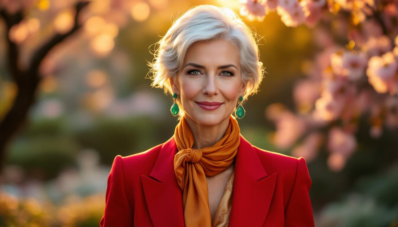
- Jewel tones like emerald, sapphire, and ruby create contrast against mature skin
- Rich earth tones such as terracotta and burgundy add warmth and dimension
- Strategic color placement near your face draws attention to your best features
The power of accessories to transform pale outfits
If you love your pale pieces, transform them with strategic accessories. “Adding vibrant accessories near your face can completely revitalize an otherwise aging outfit,” explains Hayes. Consider these quick fixes:
- Drape a bold scarf in emerald or royal purple near your face
- Add statement earrings in metallic or jewel tones
- Layer with a vibrant cardigan or jacket over pale basics
Building a flattering spring capsule wardrobe
Creating a thoughtful capsule collection is your secret weapon. “Think of your wardrobe as a garden—you need to occasionally pull the weeds (those aging pale colors) and plant fresh blooms (vibrant alternatives) to keep your style flourishing,” suggests Barrett.
How to assess which colors truly flatter you
Not sure which colors work for you? Try this at-home test: hold different colored fabrics near your face in natural light. If your skin glows and eyes brighten, you’ve found a winner. If you appear tired or washed out, like a portrait that’s lost its definition, it’s time to reconsider that shade.
Remember, embracing vibrant colors isn’t about looking younger—it’s about looking your absolute best at every age. Which color will you add to your spring wardrobe this season?