Embracing dark colors in interior design is having a major moment this spring 2025. Gone are the days when dark walls were considered impractical for small spaces. In fact, deep, rich hues can create an illusion of expanded space when used strategically. Let’s dive into how you can incorporate these moody tones without making your space feel cramped or confined.
Why dark colors actually enhance spatial perception
“Dark colors create visual depth by blurring spatial boundaries, making walls appear to recede,” explains Helen Shaw, color expert at Benjamin Moore. “This optical illusion works particularly well in spring when natural light increases, allowing these deep tones to show their dimensional qualities.” Try Benjamin Moore’s Blue Nova or Ashland Slate for an immediate spatial transformation.
The technique works by minimizing the visual definition of corners and edges, essentially “pushing back” the walls. Historical European interiors have leveraged this effect for centuries, using rich tones to create intimate yet spacious environments.
The monochromatic approach: Color drenching for spring
One of the most effective techniques for using dark colors is what designers call “color drenching.” Ruth Mottershead, Creative Director at Little Greene, explains: “Colour drenching is simply taking a single color, or closely related colors from skirting to ceiling and everything in between, including walls, window frames, doors, and radiators.”
This spring, extend your favorite dark shade to ceilings and trim to create a cohesive, immersive environment that blurs visual boundaries. The result? A space that feels expansive rather than confined. Consider rich, seasonal colors like Farrow & Ball’s Hague Blue for maximum impact.
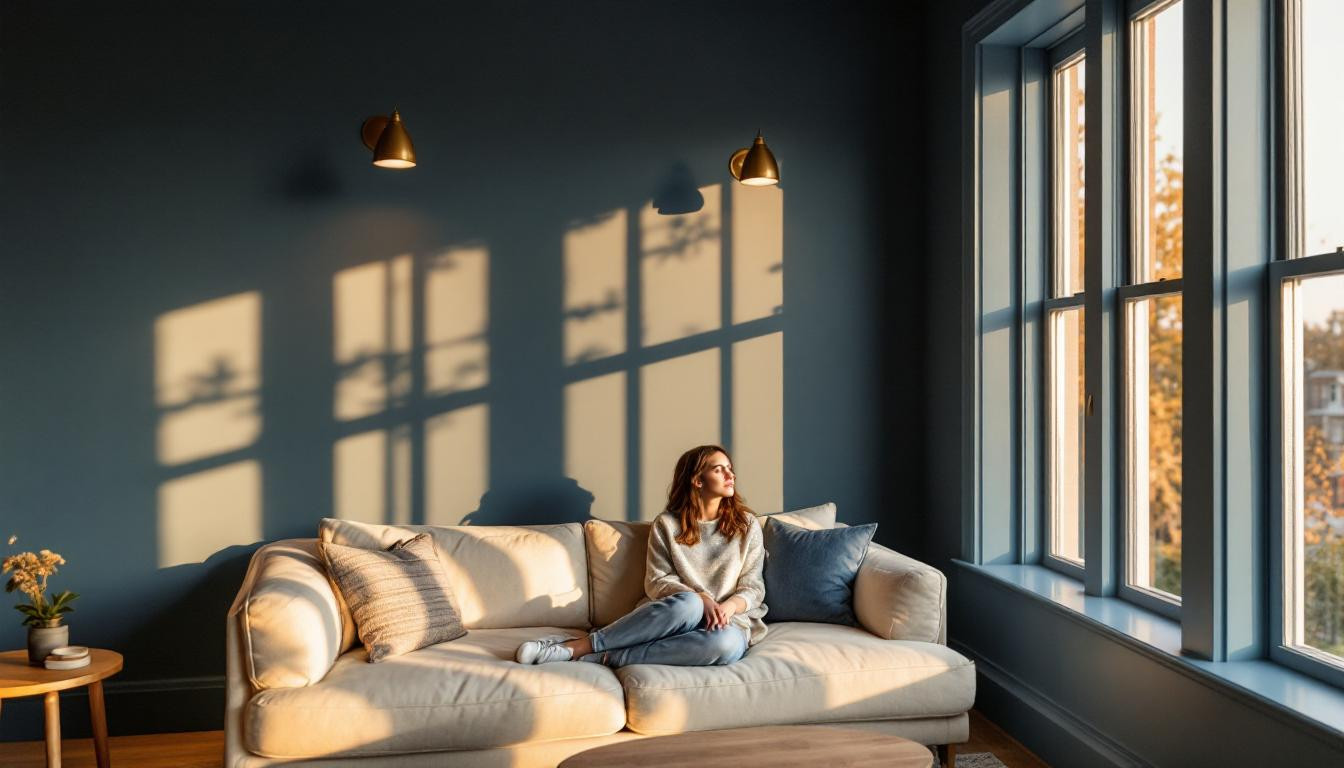
Light and contrast: The essential balance
The key to successful dark interiors lies in contrast. “To decorate with dark colors without making rooms feel dull, start by incorporating contrasting lighter shades with furniture,” advises interior designer Soledad Alzaga. This spring, pair dark walls with:
- Cream or off-white upholstery
- Natural linen textiles
- Light wood accents
- Metallic fixtures (especially brass and copper)
I recently transformed my small bedroom using this exact approach, creating what feels like a luxurious retreat despite its modest dimensions.
Finish matters: Matte is your friend
Nadia Watts, renowned interior designer, notes: “Dark colors, especially when color-drenched by painting trim and or ceilings the same color, ground a room.” For best results this spring, opt for matte finishes that reduce glare and soften the intensity of dark colors.
Matte surfaces absorb light rather than reflect it, creating a velvety depth that makes walls recede visually. Benjamin Moore’s Onyx 2133-10 in a matte finish delivers dramatic impact without harsh reflections.
Strategic placement: Where to use dark colors
If you’re hesitant about all-over dark colors, consider strategic application. “Start small by using moody shades in a powder bath or on an accent wall before going big,” suggests designer Denise Morrison. Spring 2025 is seeing a trend toward dark accents paired with neutral palettes.
Effective placements include:
- Dark ceilings with lighter walls
- Dark flooring with light furniture
- A dark accent wall behind your bed or sofa
- Dark built-ins or cabinetry
Texture and material play: Creating dimension
“Moody colors inherently add a sense of warmth and sophistication, inviting us to slow down, get comfortable, and fully immerse ourselves in our surroundings,” explains designer Nina Lichtenstein. This spring, enhance dark walls with textural elements like velvet cushions, natural wood, or woven accents.
I’ve seen spectacular results with dark walls paired with textural elements in bathrooms, where the combination creates a spa-like retreat effect.
Lighting considerations for dark-walled spaces
“It’s embracing the darkness or lack of light, instead of feeling like it’s missing something,” notes designer Alicia Cheung. When working with dark colors, strategic lighting becomes essential. Consider layered lighting with:
Table lamps, wall sconces, and picture lights create pools of illumination that add dimension to dark walls. Warm-toned bulbs (2700-3000K) enhance the richness of dark colors while maintaining a welcoming atmosphere.
Spring forward with dark colors
As we embrace the spring season, dark colors offer unexpected freshness and sophistication. “Patrick O’Donnell from Farrow & Ball puts it perfectly: “Using a darker color, particularly in a small or dim space, can feel brave. But introducing a dark color can work wonders and create a really cozy feeling.” The depth and richness of dark hues create the perfect backdrop for spring’s natural elements and lighter accents, proving that embracing the dark side might be your brightest design decision yet.