As we spring into 2025, our fashion choices become more crucial than ever. After turning 50, one color stands out as particularly problematic – that vibrant, unmistakable bright red that can transform an elegant mature woman into something reminiscent of a circus performer. Let’s explore why this shade deserves caution and what alternatives can enhance your natural beauty this season.
Why bright red becomes problematic after 50
Bright red creates a jarring effect against mature skin, drawing attention to areas you might prefer to downplay. “Red is one of the most difficult colors for women over 50,” explains fashion consultant Margaret Manning. “It tends to accentuate skin redness and visible blood vessels, which become more prominent with age.”
Think of your complexion as a canvas that has naturally softened over time – placing a loud, vibrant red against this canvas creates a disharmony that can age rather than flatter your features.
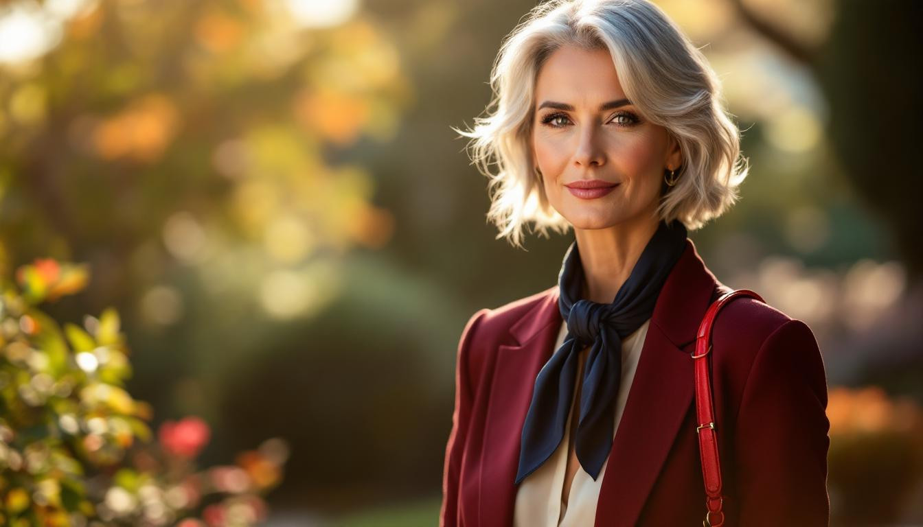
The springtime alternative: sophisticated burgundy
Instead of abandoning red entirely this spring, consider its sophisticated cousin: burgundy. Personal stylist Amelia notes, “Softer, darker versions of red like burgundy provide warmth without the harshness of bright red, creating an elegant look perfect for the season.”
Burgundy offers the perfect compromise for those who love red’s energy but need a more flattering option. It pairs beautifully with spring florals while maintaining sophistication.
Navy: the timeless alternative that flatters everyone
Navy colors add sophistication after 50 in ways bright red simply cannot. This timeless hue provides depth and elegance without overwhelming your natural coloring, acting like a rejuvenating frame for your face.
“Navy blue creates a slimming effect while adding an air of authority and confidence – exactly what women over 50 should embrace this spring,” shares color consultant Sarah Matthews.
Other colors to approach with caution
Beyond bright red, several other shades deserve careful consideration:
- Pastels, especially baby pink, which can blend with aging skin
- Fluorescent or neon colors that create jarring contrasts
- Pure stark white, which highlights fine lines
- Beige tones too similar to your skin tone
Spring 2025’s most flattering palette for mature women
This season, embrace these alternatives that enhance rather than detract from your natural beauty:
- Olive green and terracotta – earthy tones that add warmth
- Soft pinks with the right undertones (not baby pink)
- Jewel tones like emerald and sapphire
- Warm neutrals such as ivory and camel
Complementary beauty choices that enhance your color palette
Your clothing colors work in harmony with other beauty choices. Consider chili-chocolate hair color adds youthful glow as a beautiful complement to your new color palette. This trending blend provides warmth and dimension that bright red clothing cannot.
Similarly, 5-minute natural makeup routine for mature skin can enhance your features without competing with your clothing choices.
The perfect silhouette to complement your new colors
Color choices work hand-in-hand with silhouette. For a complete spring refresh, wide-leg jeans for a slimmer waistline pair beautifully with this season’s most flattering colors.
Radiance from within completes your look
Your skin’s natural glow forms the foundation of any color strategy. Many women find that peptide skincare for enhanced radiance creates the perfect canvas for their new color choices.
Remember, bright red isn’t forbidden territory – it simply requires strategic deployment. As color consultant Amelia wisely notes, “The best accessory you can wear after 50 is your smile, but the right colors help bring out your brightest one yet.” This spring, choose colors that illuminate rather than overpower your natural beauty.